Monday, August 30, 2021

Check out the new FMX 238 blog!

Hey, it's been a while since I really posted here! Anyway, if you like the projects I've made, feel free to check out my 2D animation blog that will be updated during this new semester!


https://tstolsfmx238.blogspot.com/

Wednesday, December 4, 2019

Portfolio

Well, the semester has come to an end. But as Dr. Seuss once said: "Don't cry because it's over, smile because it happened!" So, this project is allowing us to smile, by looking back at each of the projects I have created over the past few months...


Monday, December 2, 2019

Business Cards

For this assignment, the goal was to create fictional business cards. Using our logos from earlier, along with a cool design, I was able to create a document using InDesign to create a very good business card!

I made three designs, with varying color differences in the backgrounds and text:


I also added a small little hidden message in the phone number! The phone number is a fake number that actually is just numbers of Formula 1 drivers in a random order, and formatted to look like a real number!


Monday, November 11, 2019

Somewhere: Toy Private Tstols

Earlier in the year, this project seemed very simple, and was the one I was most looking forward to. I would be able to use Photoshop and add myself to an image of somewhere I've never been. I had loads of ideas, I could place myself at Anfield Road, Liverpool's famous football stadium, I could place myself on an Formula 1 Podium, celebrating like I just won the World Driver's Championship, I could do a lot of things. But then a curveball was thrown, an extra challenge. Like in most projects, this one came with a "catch." We had to make ourselves into toys. This was only a small challenge, as I immediately knew what I should do. As a child, I loved to play with plastic army figures, I even had figures of different nations and time periods, and had a small collection. Thus, an idea popped into my head; make myself into a plastic army figure!
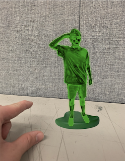

It wasn't the easiest, but also not the hardest thing to do. I first had to make my body look like it was plastic. Instead of adding a glossy finish, I decided to follow a tutorial on how to make myself look metallic, which surprisingly works well for looking plastic too!

Earlier, I took a photo of a background, with my hand looking to reach forward and pick me up. After adding myself, I wasn't done yet, I got an image of an actual green army figure online, and added the signature bottom piece of plastic that always forms at the bottom of the feet. Once I added that, all I needed to do was to add the tag brush, which I simply blended in with some pencil markings on the table.

Sunday, November 3, 2019

Black and White to Color

In high school, I performed in 11 theatrical productions. Not to brag, or anything, I was adored on the Avon Stage, and a lot of my friends would tell me that they only enjoyed the productions (since everyone was required to attend) because of my performance. Was this true? I don't know, but this image from the school magazine, writing an article about me as the "Featured Artist" in the school newsletter, was one I felt would look great in many different ways.


The first image is simply in black and white, using grayscale. For the next pictures, I will add colors to make the image pop. However, I decided to use the clothing, which is typical "Vespers" attire at my school, as the place I would add colors too.


Using the adobe colors site, I was able to create interesting creations with each color style, and it has led to great results. What really popped out to me was the Triad, which looks somewhat similar to the suit used in the "Joker" movie. I couldn't choose a favorite from these 6, I really enjoy all of them, and I think they all look really interesting.

Monday, October 28, 2019

Tag Brush

There's nothing really special about this project, it's simply the logo I made in "Homage to my Alma Maters" (check it out by scrolling below), and I simply used some effects and created a tag brush with it here.

My inspiration for the color was to create a cool effect. The blue, green and red added a nice shadow effect that I quite liked, and it looks even cooler on the edges of the logo, where you can see the green and red more distinctively on each side.


Wednesday, October 23, 2019

My Self Portrait 20: "Break New Ground"

When it came to making a self-portrait that could be in the style of a cool background or motivational poster, I immediately knew where I would take my inspiration:

Fifa.

I decided to base my portrait off of the Champions Edition cover for Fifa 20, the most recent installment of the soccer series, featuring Liverpool FC star Virgil Van Dijk:

Selecting my style would be the easy part, making it would be harder. First I had to get a picture to use for the screenshot. I used a full version of the image of Virgil on the cover as the inspiration to my photo: 


So, I decided to replicate his pose using my timed iPhone as a camera, a Virgil Van Dijk jersey, and tried to don a menacing look towards the camera.


I might need to work on that menacing look, but I was set. Now I just needed to get to work. Making the background for my project was quite easy. I simply made some rectangles, and made the PS4 logo at the top. The hard part would come very soon though, when I'd have to make the actual portrait part of the cover. I used a simple gradient for the background of where my body would rest, and then drew myself onto it. It took a while, roughly six hours to fix that all up. Once I finished drawing myself, I was almost finished, but I needed to add a gradient mesh! I decided to add some shadows to my arms and my face, given how shadows were most noticeable for those areas in the picture. 

Anyway, here is my final product:


Overall, I'm really proud of my work, and even though I had to forgo a few parts (I couldn't place the logo over my torso like in the actual cover, and I couldn't add the interesting bits in the background since the decisions were even more complicated,) I still think it looks very nice, and I might just print it and use it in the cover of my actual game!